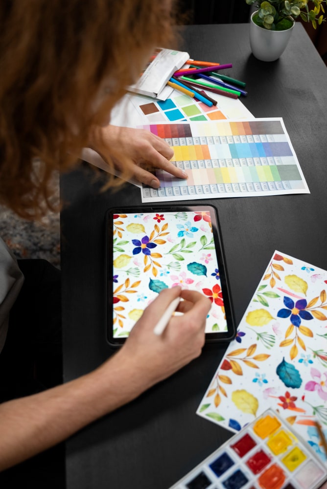
Color is a fundamental element in User Experience (UX) design, as it has the power to influence emotions, guide user behavior, and impact overall user satisfaction. Color theory in UX design is an intricate field that delves into the psychological and visual aspects of color, aiming to create intuitive, engaging, and aesthetically pleasing digital experiences.
THE SIGNIFICANCE OF COLOR IN UX DESIGN
Color is a visual language that communicates emotions, information, and functionality in the digital realm. In UX design, it plays a critical role in several aspects:
- Emotional Impact: Colors can elicit emotional responses. Warm colors like red and orange can convey energy and excitement, while cooler colors like blue and green often evoke calm and trust. Designers can use color strategically to create the desired emotional tone for the user experience.
- Visual Hierarchy: Colors help establish visual hierarchy, directing users’ attention to the most important elements on a webpage or app. This assists users in quickly understanding the content and taking desired actions.
- Brand Identity: Consistent color usage reinforces brand identity and recognition. Brands often have distinct color palettes that set them apart from competitors and create a sense of familiarity.
- Accessibility: Color choices in UX design should also consider accessibility. Designers must ensure that color combinations meet accessibility guidelines, making content readable for users with visual impairments.
KEY PRINCIPLES OF COLOR THEORY IN UX DESIGN
Color Psychology: Understanding color psychology is crucial in designing for emotional impact. Different colors evoke different emotions and associations, and designers should use this knowledge to align the color palette with the desired user experience. For example, a health and wellness app may use calming blue and green hues, while a food delivery app may employ vibrant, appetite-stimulating colors.
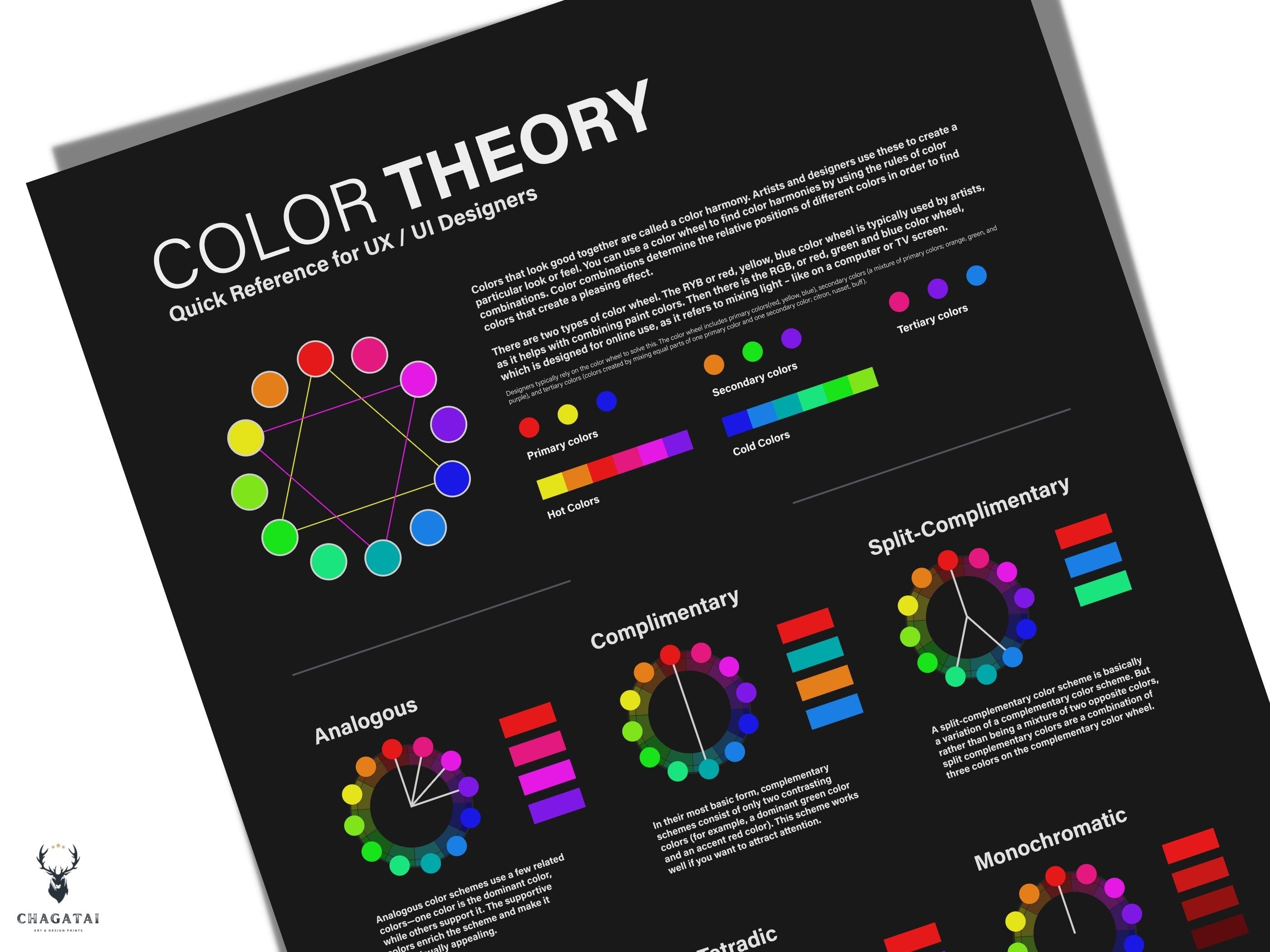
Color Harmony: Color harmony involves selecting color combinations that work well together. The color wheel, which includes primary, secondary, and tertiary colors, serves as a valuable tool for creating harmonious palettes. Common color harmonies include complementary, analogous, and triadic color schemes. Designers must choose color combinations that are visually pleasing and legible.
Contrast: Contrast is a fundamental principle in UX design. High contrast between text and its background, for instance, improves readability. Designers must consider the contrast ratio to ensure that text and important elements stand out clearly. This is essential for accessibility and ensuring content is readable by all users.
Cultural Considerations: Color symbolism and meaning can vary across cultures. Designers working on global projects should be mindful of cultural associations and preferences for color. What may symbolize luck or celebration in one culture could have a different meaning in another.
Accessibility: Creating accessible designs is a moral and legal imperative. Color theory in UX design intersects with accessibility when considering color-blind and visually impaired users. Designers must ensure that content remains distinguishable, even for users with color vision deficiencies.
PRACTICAL APPLICATIONS OF COLOR THEORY IN UX DESIGN
- Creating a Visual Hierarchy: Color is a powerful tool for establishing a visual hierarchy in a user interface. Designers use color to guide users’ attention toward key elements, such as call-to-action buttons, important messages, or navigation links. For example, a bright, contrasting color can be used for a “Sign Up” button to encourage user interaction.
- Feedback and Confirmation: Color can provide valuable feedback to users. For instance, using green to indicate a successful action (e.g., a submitted form) and red to signify an error or failure helps users quickly grasp the status of their interactions. These color cues are efficient in reducing friction in the user experience.
- Creating a Consistent Brand Identity: Consistency in color usage is vital for brand recognition. Brands often have a primary color palette associated with their identity. For example, Facebook is recognized by its dominant blue color, and McDonald’s uses a distinct combination of red and yellow. Ensuring that the colors align with the brand’s values and message is essential.
- Highlighting Calls to Action: Calls to action (CTAs) are critical elements in UX design, as they prompt users to take specific actions. Using a color that stands out against the surrounding content can help draw users’ attention to these essential elements. This, in turn, increases the likelihood of user engagement and conversion.
- Enhancing Information Architecture: In complex digital environments, color can help with organizing information and content. Using a color-coded system to categorize or group related content makes it easier for users to navigate and locate the information they seek. This is particularly useful in dashboard design or large-scale websites.
Color theory in UX design is a multifaceted discipline that combines artistic, psychological, and technical aspects to create effective and appealing digital experiences. It goes beyond aesthetics; it is about influencing emotions, guiding user behavior, and ensuring accessibility. Successful UX designers understand the principles of color theory and use them to create meaningful and engaging user interfaces.
By mastering the art of color in UX design, designers can wield a potent tool for crafting user experiences that are not only visually appealing but also emotionally resonant and functional. It is through the strategic and thoughtful application of color that designers can create digital environments that users find intuitive, enjoyable, and memorable.
For more blogs related to design: https://www.dotsod.in/blog/
Follow DOT School of Design on Facebook, Instagram, LinkedIn, Medium and YouTube


